


Recession contagion, cash and Mary Poppins – what's been keeping me busy
Recession contagion, cash and Mary Poppins – what's been keeping me busy
Oh, and spotting a mistake in the budget papers

Hello. I promised my revived newsletter would never come out more than weekly, and I’ve been true to my word.
Just before I left for school holidays (I’m back now) I wrote that the worst case scenario was that the United States kept pushing up interest rates until it brought on a US recession, and that Australia got pressured to do the same.
The mechanism would be the exchange rate:
Whenever the US hikes interest rates investors buy US dollars to take advantage of the higher rates. This forces up the price of the US dollar in relation to currencies of countries that didn’t hike.
This means unless countries such as Australia hike in line with the US, the values of their currencies are likely to fall in relation to the US dollar – meaning their values are likely to fall in relation to the currency in which most trade takes place.
This means more expensive imports, which means more inflation. And Australia’s Reserve Bank is trying to contain inflation.
The upshot is whenever the US pushes up rates (no matter how recklessly) there’s pressure on Australia to do the same, simply to stop inflation getting worse.
Fortunately, since I wrote that piece Australia’s Reserve Bank has broken away from the pack, hiking rates by only 0.25 points this month instead of 0.50 points on the previous four occasions (and 0.75 points as the US Fed has).
Breaking away is an excellent strategy if the US pushes up rates to the point where it is about to bring on a US recession. Then, as I explained, Australia can
stand back and not lift rates, letting the collapse of the US economy bring down inflation by itself.
AMP Capital’s Shane Oliver believes the RBA has more leeway to go its own way on rates than the desire to maintain the US-AUD exchange rate would suggest, writing on Friday:
Should the RBA be worried about the falling $A? The short answer is no unless it falls a lot further: Yes, a rising interest rate differential between the US and Australia tends to push the $A down relative to the $US, all other things being equal. But most currencies have been falling against the $US – some like the pound and the Yen more than the $A. So the trade weighted index for the $A (which takes into account other currencies) is only just below its long term average which means that the potential boost to inflation from the falling $A is far less than would be implied by just looking at the fall in the $A versus the $US.
And in any case the evidence suggests that a 10% fall in the trade weighted $A will only add about 1% to inflation over 3 years which is just 0.3% per annum. So far the fall in the trade weighted index is just 6% which would add just 0.2% per annum to inflation. And 40 years ago we floated the $A so the RBA can have an independent monetary policy. Rising rates to match the Fed just to keep the $A up would defeat the purpose of floating the $A in the first place.
The RBA also has to allow that Australia has less of an inflation problem than the US with much lower wages growth, Australian households are far more vulnerable to higher rates than US households (because of more debt and short-term mortgage rates) so there is no reason to raise rates as much as the Fed.
Of course this is not to say that the RBA won’t react to the falling $A, particularly if it continues to fall sharply – but doing so could be a big mistake, needlessly boosting the risk of recession here.

Also in they past few weeks I wrote about cash, and the extraordinary profit the Australian Mint keeps making because we keep losing coins.
Usually it costs the Mint far less to make each coin than each one becomes worth the moment it is sold to a bank (before metal prices climbed, it cost the mint about 20 cents to make a $2 coin, and about 15 cents to make a 50 cent coin). The profit – the huge markup – goes straight to the Commonwealth budget as non-taxation revenue, tens of millions per year.
This financial year the government expects A$59 million, next year $67 million.
That the government can keep making money from seigniorage appears to defy common sense. Surely we’ve got just about all the coins we need. Merely replacing coins as they get worn out doesn’t earn seigniorage.
But a previous head of the Mint, Ross MacDiarmid, let the cat out of the bag in 2014 when he told a Senate committee: “most of the coins that we provide are against coins that disappear down the back of chairs, down the back of car seats, into rubbish dumps and, in some cases, are taken overseas”.
Asked whether he was seriously suggesting a hundred million or so coins per year disappear, MacDiarmid replied he was.
This means the government makes tens of millions per year replacing – at a huge markup – things we have lost.
Incidentally, I alerted the Mint to a mistake in this year’s May budget papers. The papers have income from “seigniorage” (which is the word for the profit made from selling coins for more than they cost to produce) dropping from A$64 million in 2024-25 to just $4 billion in 2025-26.
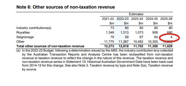
An obvious mistake. It took to Mint a troubling number of weeks to get back to me, but when it did it confirmed
A discrepancy has been identified in the Royal Australian Mint’s forecasted seigniorage figures outlined in Table 2.2 (pg. 345) of the 2022-23 Treasury Portfolio Budget Statement. This has been repeated in the Mint’s 2022-23 Corporate Plan. These figures will be updated in the 2022-23 October Budget.
Anyway, the case of the Mint is straightforward. It turns a profit by replacing lost coins and the profit is recorded in the budget as income.
The Reserve Bank is (presented as) anything but straightforward. The Bank earns far more from printing notes than the Mint does from striking coins (it probably costs it 32 cents to make a $100 note). My guess is it earnt A$6.6 billion in 2020-21. But it hides the revenue by using a formula dependent on the rate of interest that seems to assume that maybe one day those notes won’t be accepted as cash.
The RBA won’t even say what it earned from selling notes in 2020-21. As it told me…
The Reserve Bank does not list seigniorage as a line of revenue on its financial statements. Instead, the Bank records net interest income from all activities while highlighting that a large portion of this flows from its ability to issue non-interest-bearing liabilities. Net interest income then forms part of the Bank's net profit, with the Bank paying a part of its profits to the Australian Government as determined by the Reserve Bank Act 1959 and the Treasurer.
Put bluntly. The Royal Mint (RM) hands over the profits it makes from making cash whereas the Reserve Bank (RB) obscures the much-bigger profit it makes from making cash, and hands it over only when it wants to.
Owen Covick, for decades at Flinders University and now with the South Australian Centre for Economic Studies, has some fun with the way the RB treats its profits from making cash compared to the way the RM treats its profits from making cash in a “fairy story” he shared with me (PDF here).
(1) A large conglomerate business enterprise has (among its many 100%-owned subsidiaries) two which have the short-form names RM and RB. Each produces and supplies to the public a durable product. Each has a monopoly over its product. The two products are fairly close substitutes for one-another: at least in the eyes of some end-users and in some uses.
(2) The executives at RM have convinced the powers-that-be at the helm of their parent-conglomerate that their product is such that the chances of any of the RM`s customers ever bringing it back and demanding a refund are zero.
(3) The executives at RB have convinced the powers-that-be at the helm of their parent-conglomerate that there is an ever-present threat of their having to cope with 100% of their customers bringing back their product and demanding a full refund.
(4) “Naturally” this means that the accounting statements of the RM and the RB differ from one-another substantially.

Speaking of fairy stories, the Nobel Prize in Economic Sciences (yes, I know it’s not a “real” Nobel) which went to Ben Bernanke, Douglas Diamond and Philip Dybvig for their work on financial crises, reminded me of the scene in Mary Poppins.

In their announcement, the Nobel Committee referenced the similarly iconic movie It’s a Wonderful Life.
Noah Smith has written my favourite account of work that won the Nobel, explaining that Diamond and Dybvig developed a model of banking crises that explains the mechanism by why banks tend to collapse, and Bernanke showed how those collapses could bring down the real economy.
Smith points out that even
if banks had to take $1 in deposits for every $1 they lent out (which isn’t true, but just suppose) … they would still not be able to pay out all their depositors at once, if they all came running. Because most of the money is locked up in illiquid assets.
Bernanke demonstrated that bank collapses are different to collapses of other firms, because of a feedback loop between asset prices and corporate borrowing.
When asset prices are high, companies can easily borrow a lot of money, because they can use the expensive assets as collateral, so banks don’t have to think too hard about whether the borrower will default on the loan. But when asset prices drop, companies suddenly find it much harder to borrow from banks, because now banks suddenly have to worry that they won’t pay the money back… So companies just borrow less and invest less, which reduces economic activity. This reduces asset prices even more (because asset prices depend on the real economy), which hurts lending even more, in a vicious cycle. That cycle is called a “financial accelerator”.
The lesson – monetary policy works through asset prices. It ain’t just the cost of borrowing.
Finally, housing rents.
Last newsletter I quoted Ben Phillips, who pointed out that actual rents are climbing much more slowly than are advertised (“asking”) rents for new leases – indeed, much more slowly than general inflation.

That’s because most rents aren’t adjusted very often. So it makes sense to pay attention to the rents that are actually paid, right?
The answer is “yes”, if you are trying to establish what’s happening to the cost of living.
But, as Paul Krugman pointed out on Friday, “no” if you are trying to assess economic overheating. Advertised rents tell us about overheating now. Actual rents tell us what was happening in the past. It’s a fair point.
Why have advertised rents been soaring (if, thankfully, more slowly of late)?
We know what hasn’t been driving rents up. It hasn’t been population growth, although it might have been a pandemic-driven slowdown in the rate of home-building.
The RBA’s Luci Ellis identifies something more human: the pandemic made us change the way we thought about our homes.
Spurred by the experience of lockdown and self-isolation, many people understandably wanted a bit more space, and perhaps a garden. Some also needed space where they could work, or perhaps just fewer flatmates to share that space with.
And group houses suddenly seemed dangerous. While some renters moved back in with their parents (and some have since moved back out) many moved in with partners.
On the question of who you would rather be locked down with, at least some Australians have voted with their removalists' van, by moving out of their share house and in with their partner.
Group houses can house four or five people. Love nests house two.
The difference might be important.
That’s enough for now. I’m back at work, and the budget awaits.